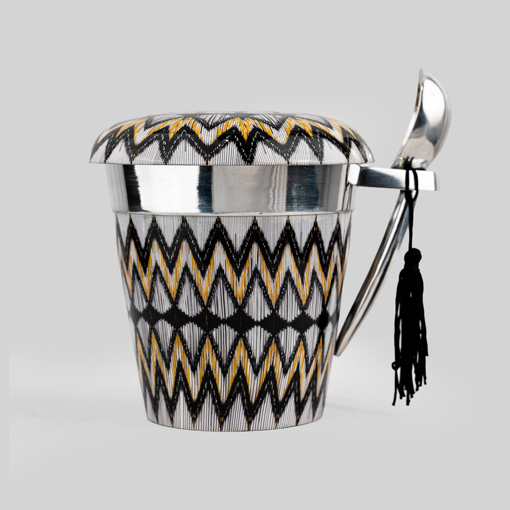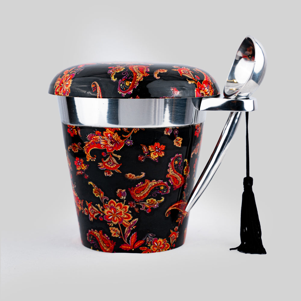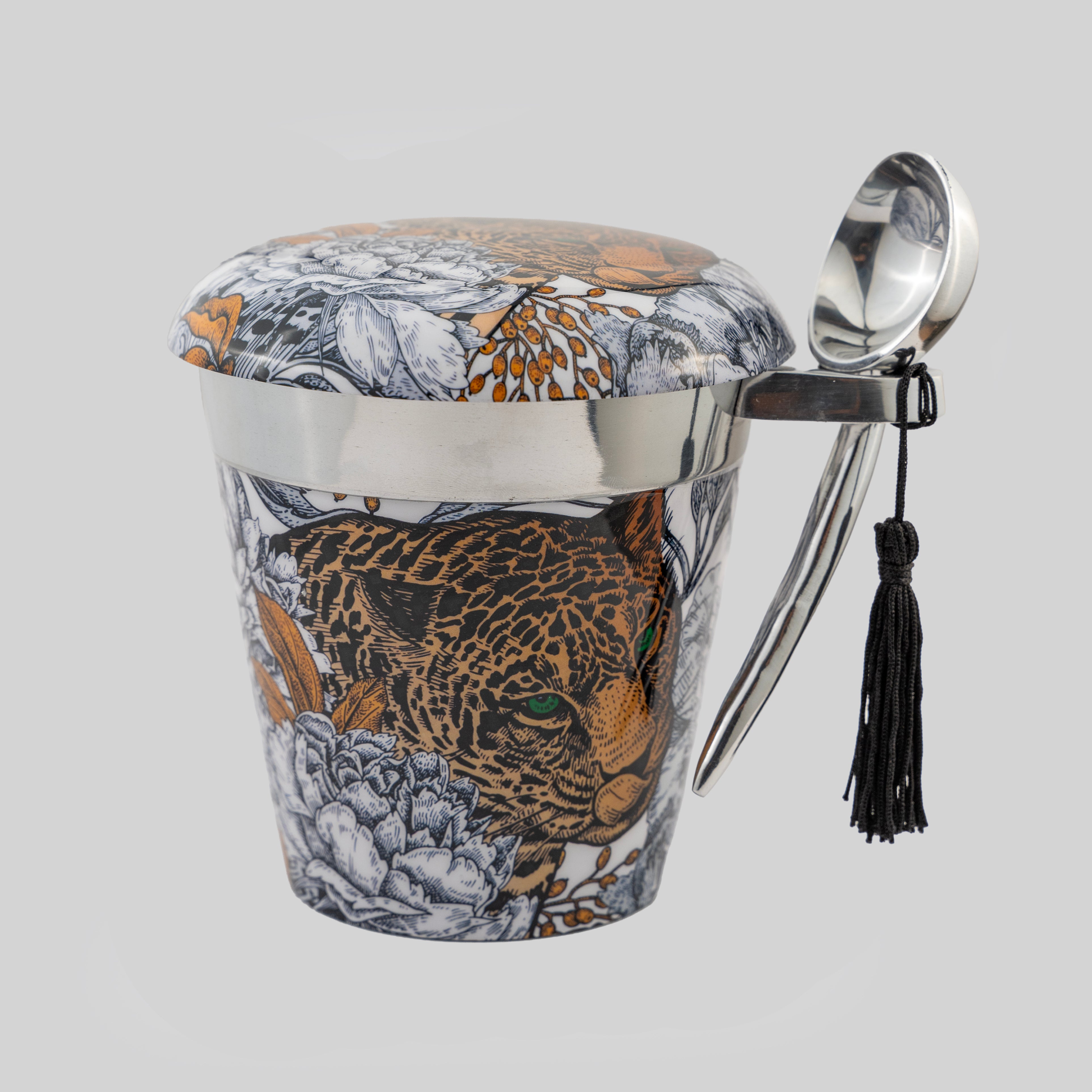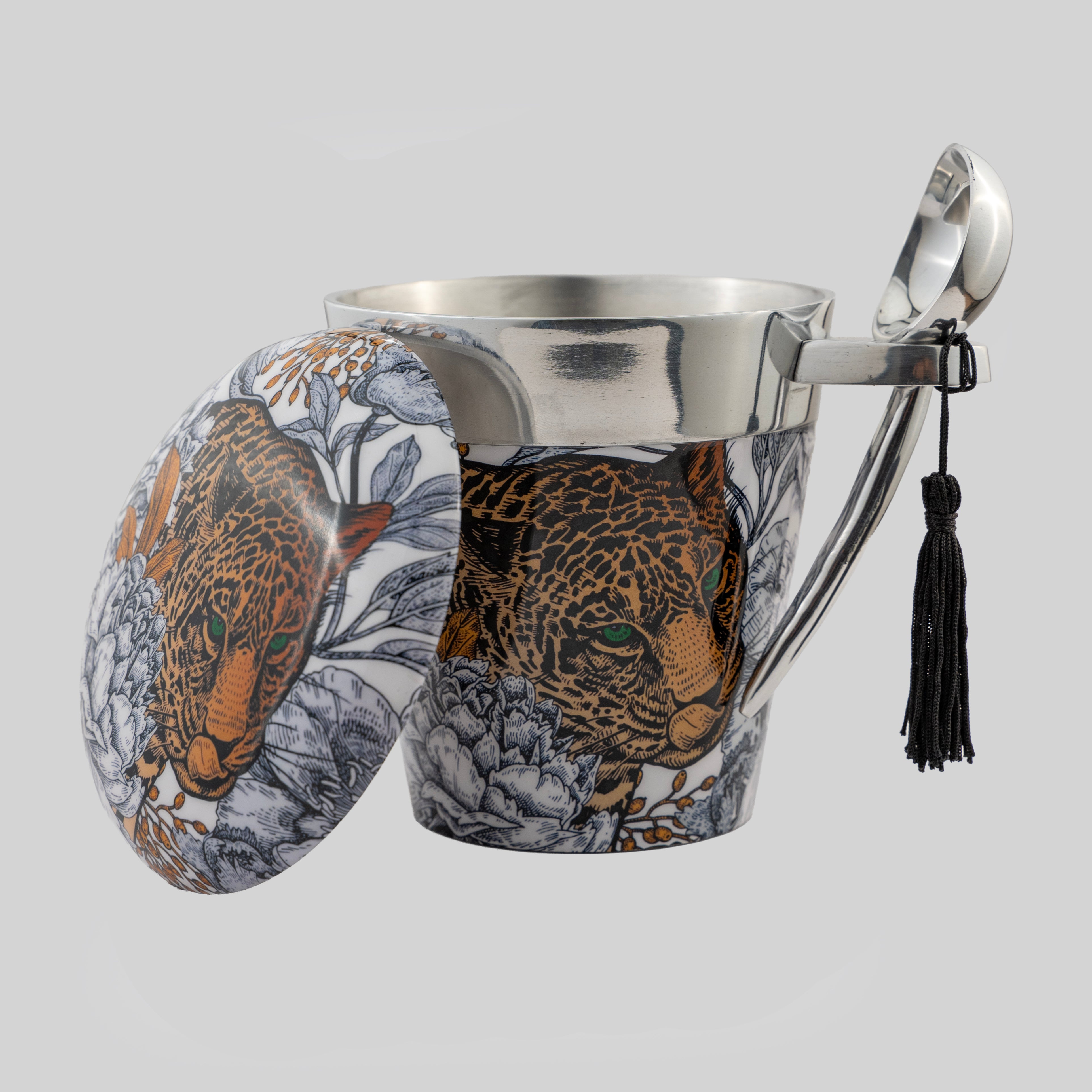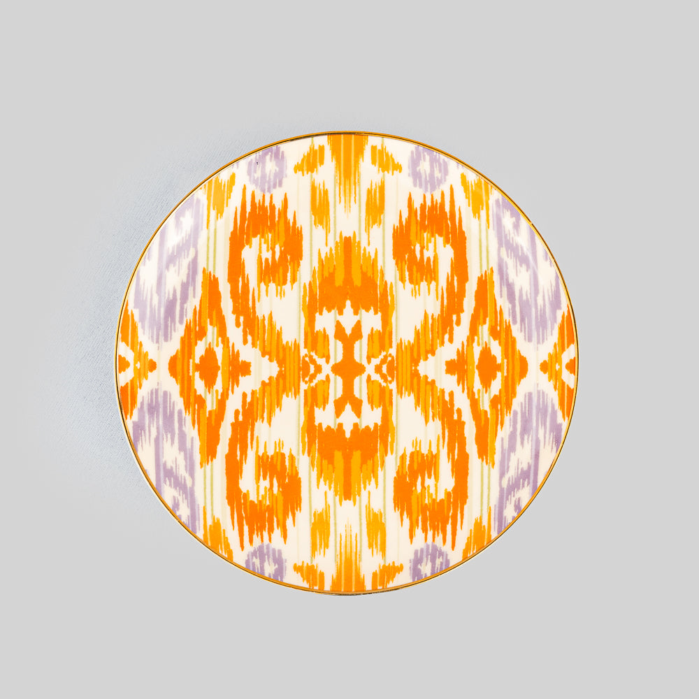


A photograph can hold an entire season of life: a wedding toast, a parent’s familiar smile, a sunlit holiday, a child caught mid-laugh. Yet it is the frame that decides how that memory lives in a room. Thoughtful designer photo frames decor gives personal images the presence they deserve, turning a quiet corner of the home into something warm, layered, and distinctly yours.
A beautiful frame is not simply a border. It is a styling object with its own material, proportion, and point of view. Placed on a dining-room console or beside a stack of art books, it can bring softness to a sculptural surface and meaning to a carefully curated space.
Why Designer Photo Frames Decor Changes a Room
The most inviting homes are rarely made from decorative objects alone. They are composed of objects that reveal the people who live there. A framed photograph adds an emotional counterpoint to polished glassware, a hand-finished tray, or a statement vase. It makes a room feel collected rather than staged.
Designer frames add another layer: visual intention. Consider the difference between a standard black frame and one with a richly patterned surface, a horn-inspired detail, a high-shine finish, or an artful silhouette. The image remains the heart of the piece, but the frame gives it a language that can echo the rest of the room.
This is particularly valuable in entertaining spaces. A frame on a bar cart might hold a favorite travel photograph from Italy. On a sideboard, it may display an old family portrait near serving pieces chosen for celebrations. These details give guests something more personal to discover, and they make hosting feel less like presentation and more like welcome.
Begin With the Feeling, Not the Empty Surface
Before choosing a frame, decide what you want the corner to communicate. A bedside arrangement may call for intimacy and calm. A living-room console may need drama and conversation. A dining table or buffet can carry a more celebratory mood, especially when the frame is paired with candleholders, bowls, or a distinctive serving tray.
The photograph itself offers the first clue. Black-and-white portraits often suit graphic, sculptural frames or warm natural finishes. A vivid vacation image can stand up to a playful print or saturated color. Vintage family photographs look especially compelling in frames with tactile character, such as wood-grain effects, antique gold tones, or richly detailed borders.
There is no need to match every finish in the room. In fact, exact matching can make a space feel overly coordinated. A brass-toned frame beside a dark wood table, or a patterned frame against a clean marble surface, often creates more depth. The goal is visual conversation, not uniformity.
Choose Scale With Confidence
A frame that is too small can disappear on a large console, while an oversized frame may overwhelm a narrow side table. Let the furniture guide the choice. On a wide surface, one larger frame or a small grouping of varying heights usually feels more purposeful than several identical pieces scattered across the length.
For a compact nightstand, select one frame with enough presence to be noticed without competing with a lamp, book, or water glass. On a bookshelf, smaller frames work beautifully when layered with objects of different heights. Leaning a frame slightly behind a ceramic accent or a stack of books creates an effortless, collected composition.
As a general styling principle, vary the scale rather than repeating it. A tall vertical portrait beside a smaller landscape image gives the eye movement. Two frames of the same size can work, but they need a reason to feel paired, such as matching finishes, related photographs, or a symmetrical placement on either side of a centerpiece.
Build a Frame Arrangement That Feels Collected
The most elegant photo displays have rhythm. They do not look as though every piece arrived at once or was measured into position with excessive precision. Start with a focal image, then let supporting elements build around it.
On a console table, place the largest frame slightly off-center. Balance it with a low decorative object, such as a bowl or lidded box, then add height through a lamp, branch arrangement, or candleholder. The frame should remain visible, not tucked behind décor. Personal pieces deserve breathing room.
For a shelf or credenza, overlapping can be especially effective. A smaller frame placed in front of a larger one adds depth, while a slim art book or small object grounds the arrangement. Keep the overlap modest enough that each image can still be appreciated. If every frame is competing for attention, edit rather than add.
A gallery wall benefits from a different approach. Here, repetition creates cohesion. You might choose one unifying feature, such as a family of warm-toned finishes, a recurring border style, or a shared palette within the photographs. The frames do not have to be identical. A mix of textures and dimensions often feels more refined, provided the collection has a visible thread connecting it.
Materials That Set the Mood
Material changes the emotional temperature of a frame. Glass and mirrored finishes bring lightness and polish, making them natural choices for contemporary rooms or spaces with a glamorous edge. They reflect candlelight beautifully when placed near a dining area or bar setup.
Wood and wood-look finishes offer warmth, grounding a room filled with smooth stone, metal, or lacquered surfaces. They work well with candid photographs, travel images, and interiors that favor a relaxed but elevated sensibility. The grain, tone, and finish matter: darker woods feel formal and dramatic, while lighter tones are softer and more casual.
Metallic frames can range from quietly classic to boldly decorative. Brushed gold, antique brass, and warm champagne tones are particularly versatile because they complement both neutral palettes and richly colored interiors. A high-shine metallic finish makes more of a statement, so it is best used where the room can support a touch of glamour.
Patterned and illustrated frames offer the strongest expression. They can pull a color from a rug, coordinate with printed table linens, or add personality to an otherwise restrained setting. Use them as focal accents rather than placing too many together. One remarkable print has more impact than five competing patterns.
Let Photographs Belong to Everyday Rituals
Photo frames are often reserved for mantelpieces and bedroom corners, but their most memorable role may be closer to the moments people share. A framed image on a dining-room sideboard can become part of the atmosphere before guests sit down. A favorite wedding photograph near a tea set or coffee service makes an ordinary afternoon ritual feel more intimate.
In an entryway, choose an image that feels like a greeting: a family portrait, a beloved pet, or a place you return to in memory. In a home office, select a photograph that restores perspective during a busy day. In a guest room, a frame can be a gentle expression of hospitality, especially when it holds an image connected to the home’s story.
Tyetye approaches decorative accessories with this same belief: the finest pieces are not only beautiful to look at, but meaningful in the rituals they accompany. A frame can stand beside a tray, a set of coasters, or a candle and still hold its own, because it carries something no purely decorative object can replicate.
A Few Details That Keep the Look Elevated
Choose image quality carefully. A beautiful frame cannot rescue a dim, pixelated print. Print photographs on matte or fine-art paper when possible, especially for portraits and black-and-white images. The softer finish reduces glare and gives the display a more considered appearance.
Pay attention to matting, too. A white or ivory mat creates breathing room and can make a smaller image feel more substantial. Skip it when the photograph already fills the frame with strong color or graphic composition. Neither choice is inherently better; it depends on whether you want the image to feel airy and gallery-like or immediate and immersive.
Finally, rotate your photographs. Seasonal gatherings, new milestones, and rediscovered family images deserve their turn in view. Refreshing a frame is one of the simplest ways to make a familiar room feel newly personal, without changing the furniture or starting over.
The most beautiful homes leave room for memory. Choose frames that speak to your style, fill them with images that matter, and let those small, visible stories make every gathering feel a little more like home.