

A beautiful table rarely announces its price. Instead, it creates a feeling: the glass catches candlelight, the plate has a satisfying weight in the hand, and every detail seems chosen rather than simply placed. That is what makes tableware look expensive - not excess, but an assured sense of material, proportion, and intention.
Luxury on the table is less about setting out the most pieces and more about giving each piece a role. A thoughtfully styled breakfast for two can feel as considered as a celebratory dinner, especially when color, texture, and small finishing details work together. The result is a table that invites guests to linger and makes everyday rituals feel a little more special.
What Makes Tableware Look Expensive? Start With Material
Material is often the first cue of quality, even before a guest picks up a plate or pours a drink. Fine stoneware, porcelain, mouth-blown glass, natural linen, polished metal, and richly grained wood all bring visual depth that lightweight, overly glossy materials often cannot imitate.
This does not mean every item needs to be formal or delicate. In fact, a matte stoneware dinner plate can look more elevated than a thin, high-shine plate because its finish feels tactile and intentional. Look for surfaces with a sense of character: a gentle glaze variation, softly rounded edges, a hand-finished rim, or the warmth of a natural material. These subtle irregularities make a setting feel collected rather than mass produced.
Weight matters, too. A substantial tumbler, a well-balanced serving spoon, or a platter that sits confidently on the table communicates quality through use. The goal is not heaviness for its own sake. It is the reassuring feeling that an object was made to be enjoyed, brought out often, and remembered.
Choose finishes with depth
Expensive-looking tableware tends to have a nuanced finish rather than a flat one. Think smoked glass instead of clear glass everywhere, brushed metal instead of mirror-bright silver on every surface, or a soft ivory glaze in place of stark white plastic-looking dinnerware.
Mixing finishes adds dimension. A glossy plate can sit beautifully beside woven placemats, while a smooth glass bowl feels more compelling on a textured tray. Contrast gives the eye somewhere to rest, and it makes even a simple color palette feel layered.
Proportion Creates Quiet Luxury
A table can have lovely individual pieces and still feel unsettled if the scale is off. Oversized chargers beneath tiny plates, short glasses beside a towering centerpiece, or a narrow runner crowded with large serving bowls can make a setting feel accidental.
The most polished tables give every object breathing room. Dinner plates should feel generous without taking over the entire place setting. Serving platters should be large enough to hold food beautifully, with a border visible around the arrangement. Glassware should complement the plate height and leave room for conversation across the table.
A helpful approach is to begin with the largest element and build inward. Start with the dinner plate or placemat, add a smaller salad plate or bowl only if the meal calls for it, then place glassware and cutlery with a little space between each item. The setting immediately feels calmer and more deliberate.
Centerpieces deserve the same restraint. Low arrangements, a few sculptural candleholders, or a bowl of seasonal fruit often look more luxurious than a crowded display that blocks sightlines. A table should feel dressed, not overwhelmed.
A Cohesive Color Story Looks Considered
A luxury table is not necessarily monochrome, but it does have a point of view. Choose two or three dominant tones, then introduce contrast through a small accent. For example, warm white dinnerware, amber glassware, and deep green linens create a grounded, inviting setting. Soft blue plates paired with cream napkins and brushed gold details feel fresh yet refined.
The key is repetition. When a color appears more than once - perhaps in a printed platter, a napkin ring, and the flowers - it begins to feel intentional. This is why coordinated collections are so useful: they make it easier to build a visual story without making the table feel matched in an overly rigid way.
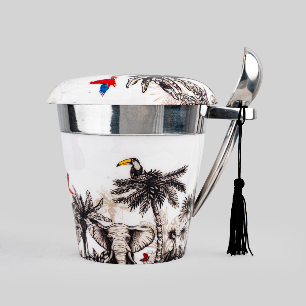
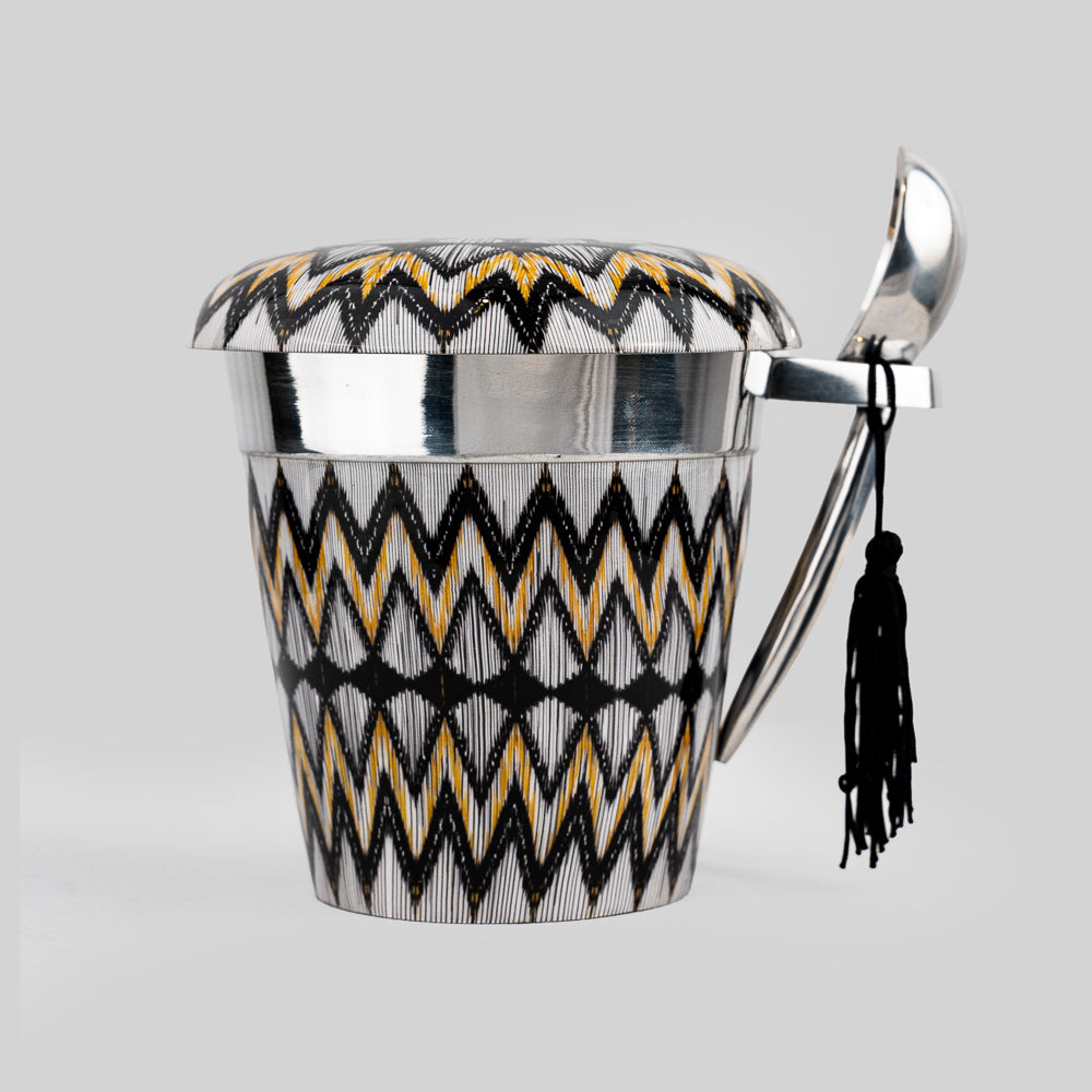
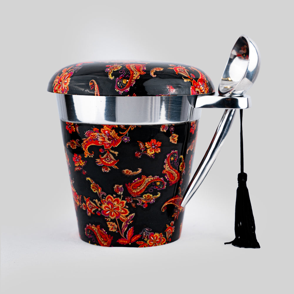
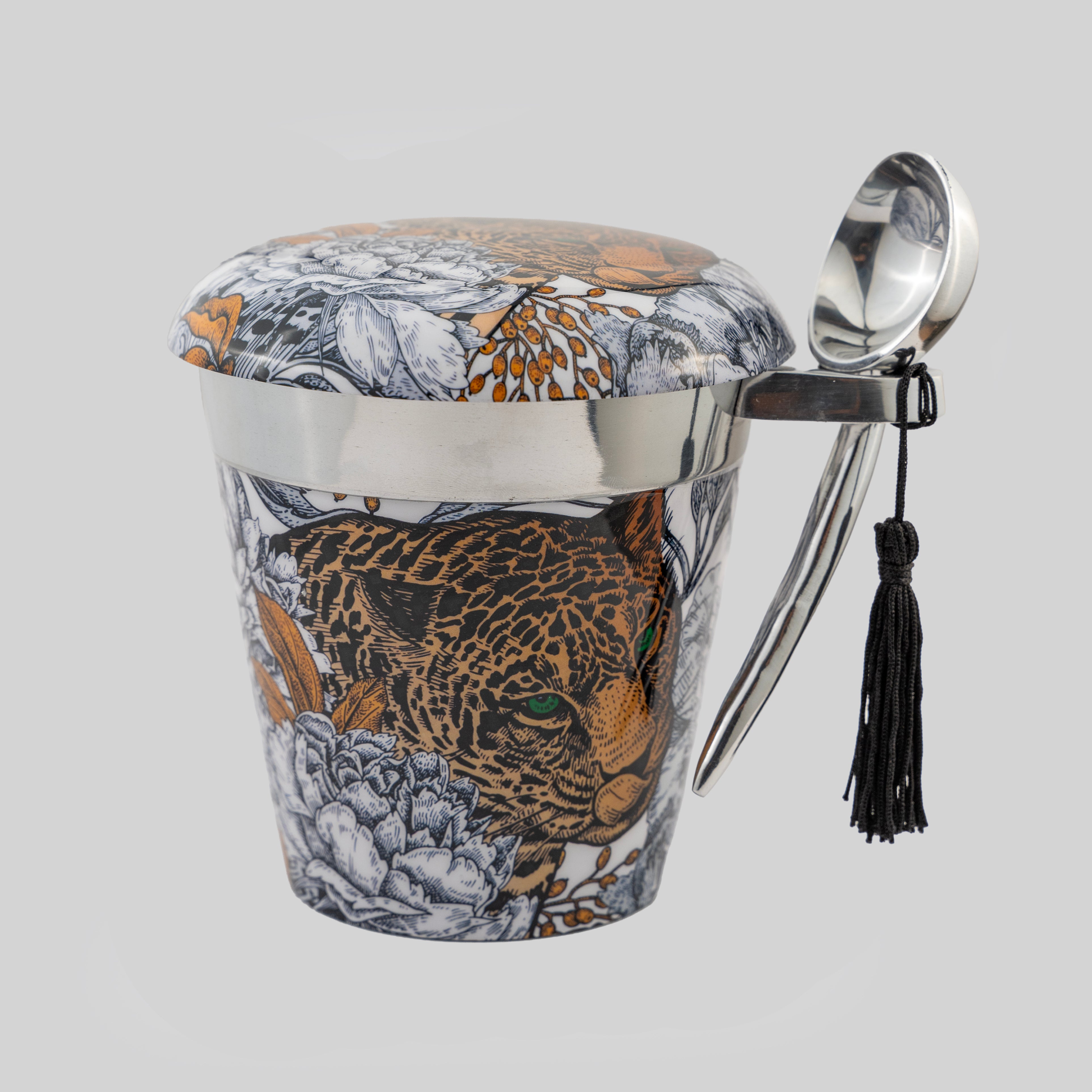
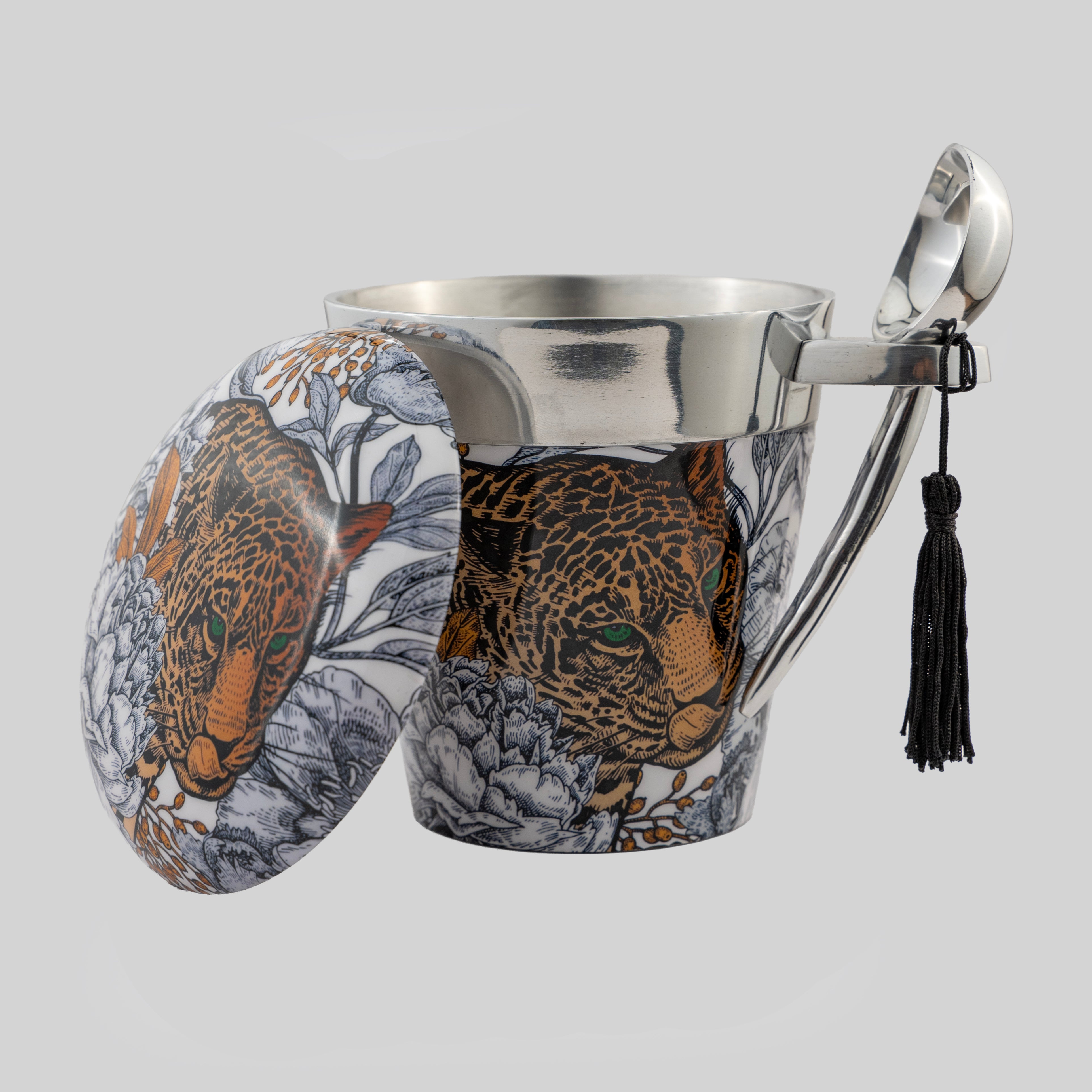
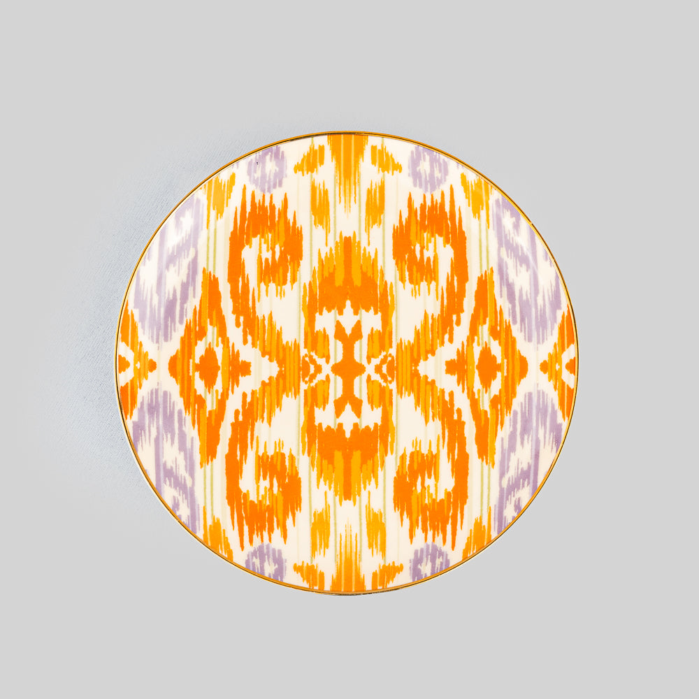
Print can be especially effective when used with confidence. An artistic motif on a tray or a statement plate brings personality to a neutral table. Let it be the focal point, then keep surrounding pieces quieter. Pattern layered over pattern can be striking, but it needs a shared color family or a clear visual rhythm to avoid feeling busy.
Layering Makes the Table Feel Complete
The difference between a functional place setting and an elevated one is often one additional layer. A placemat under the plate, a folded cloth napkin, a small side plate, or a thoughtful coaster can make the experience feel generous and welcoming.
Layering works best when it has purpose. A charger is lovely for a dinner party, but it may be unnecessary for a relaxed lunch. A napkin ring adds occasion and detail, while a simple loose fold feels more natural for a casual gathering. The occasion should guide the level of formality.
For a polished look, vary the shape as you layer. Round plates pair beautifully with a rectangular placemat or an organic-shaped serving board. A crisp square napkin can soften a setting built around round dinnerware. These small shifts create visual interest without requiring more color or ornament.
Use serving pieces as part of the design
Serving ware is where a table becomes personal. A sculptural tray, a richly printed platter, or horn-handled servers can turn food into part of the composition. Rather than transferring everything to plain bowls, choose pieces that frame the meal and carry the same mood as the place settings.
This is also where hosting becomes storytelling. A tea set can make an afternoon pause feel ceremonial. A distinctive cake stand transforms a simple dessert into a moment. At Tyetye, these are the details that help a table move beyond utility and become an expression of the host.
Glassware and Cutlery Should Feel Intentional
Glassware is one of the quickest ways to make a table look more sophisticated. Even a simple meal feels elevated when water is served in a substantial tumbler instead of a mismatched everyday glass. Choose one style for each setting, and make sure the glasses are spotless. Water marks and cloudy glass can undo the effect of even the most beautiful table.
You do not need a separate glass for every possible drink. For most gatherings, a water glass and one versatile stemmed or stemless option are enough. The luxury is in consistency and quality, not in crowding the place setting with unused pieces.
Cutlery should be clean, aligned, and proportionate to the plates. Brushed finishes, warm gold tones, black handles, or classic polished steel can all look expensive when the design is cohesive. Avoid mixing too many metal finishes unless it is a deliberate styling choice echoed elsewhere, such as in candleholders or serving utensils.
The Most Expensive Detail Is Care
No material or color palette can replace care. Pressed linens, polished glassware, crumb-free plates, and food served in thoughtful portions make guests feel considered. The table does not need to be perfect, but it should feel prepared for the people gathering around it.
Leave a little room for warmth, too. A handwritten place card, a favorite shared dish, or candles lit just before guests arrive can give a composed setting its soul. These gestures are not decorative afterthoughts. They are what make the table feel lived in, generous, and memorable.
The most beautiful tableware earns its place because it is used. Choose pieces that bring pleasure to your hands and confidence to your hosting, then let them become part of the stories told around your table.